Can I offer you a nice 2×2 in this trying time ?
Recently Prof. Scott Galloway posted about his infatuation with 2×2 matrices. He aptly described it as “Identifying two factors that define four groups can provide insight into industry dynamics and illuminate pressures and opportunities (sic)”
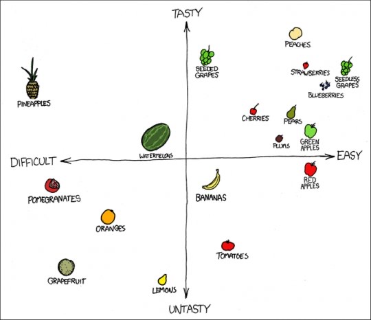
If used judiciously a 2×2 bridges strategy & execution, often pointing towards a course of action. But the beauty of it lies in its flexibility. It can be easily applied to any context – ranging from product portfolios to fruit ratings…

Galloway’s post prompted me to research into its origins, leading me to stumble upon this wonderful article by Noah Brier. It was interesting to learn that although BCG’s Bruce Henderson is often credited with popularizing the 2×2, its origin in the business world can be traced back to game theory and a Russian American mathematician, Igor Ansoff. I highly suggest reading rest of the origin story.
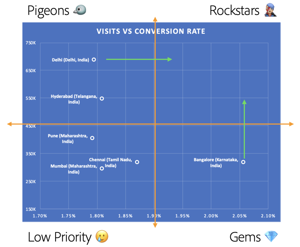
Now, let’s switch gears and see how a simple 2×2 can help inform your digital marketing strategy. We just need 3 data points from your web or app analytics – Cities driving most of your traffic, Visits/Sessions and Conversion Rates. Scatter plot this data and apply a 2×2 (can be derived from median or mean values) as shown below:

This view immediately provides us some actionable insights. We realize that cities categorized as Gems (low visits + high conversion rates) are in the need of more brand awareness content whereas Pigeons (high visits + low conversion rates) need more performance campaigns. The overall goal is to move these cities into the Rockstar quadrant. Keep shifting the 2×2 frame of reference to gain new insights.
There are endless different scenarios in which this can be utilized:
- Revenue optimization for products in a marketplace (Products – Views vs Conversion Rates)
- Prioritization of campaigns (Effort vs Outcome)
- And many more…
A 2×2 is a timeless tool for making data driven decisions. Let me know if you figure out a new way to use it!

No Comment